
 The Center for Neighborhood Technology's AllTransit database overlays transportation network data with key social and economic indicators.
As cities strive to understand how transit connects to health, economic opportunity and equity, they now have a new tool to help analyze the mass of data available.
The Center for Neighborhood Technology and TransitCenter’s AllTransit interactive database is “the largest source of transit connectivity, access and frequency data in America,” according to the site. By overlaying the data from 805 of the largest transit agencies in the country with information about jobs, demographics, even farmer’s market locations, the database offers a wealth of information about how transit serves the community.
Among its metrics is the "AllTransit Performance Score," an index based on transit connectivity, access to jobs and frequency of service.
Cities like New York, San Francisco and Boston, unsurprisingly, score well on the index.
How about Houston? Of the 73 U.S. cities with populations greater than 250,000, Houston sits in the middle of the pack with a rank of 34. That's just behind Dallas (ranked 31), and behind other Sun Belt cities such as Miami (11), Los Angeles (20), Atlanta (25) and New Orleans (29). Article continues below maps.
 Data visualizations reveal which areas have the best access to jobs via transit.
 Users can also see job access via transit against other data, including the location of low-income housing tax credit properties.
The database also provides information for several other categories, including health, equity, transit quality, jobs, economy and mobility.
Looking at jobs, for example, the report indicates Houston has 208,269 jobs accessible within a 30-minute transit commute on average for households.
That's fewer than Atlanta, which has almost one-fifth the population of Houston, and Orlando, which is one-eighth the size of Houston. The data suggests transit isn't always an easy option for Houstonians trying to get to work. However, that finding is also likely affected by Houston's vast size, relative to other cities. "Large parts of Houston have no transit service whatsoever, and those are probably dragging down the average," James Llamas, of Traffic Engineers Inc., which worked on METRO Houston's new bus route overhaul, said in an email. "Statistics that use city limits are practically incomparable between cities."
A further breakdown of Houston transit shows that it works exceptionally well for some residents. About 10 percent of the population has access to least 450,000 jobs within a 30-minute transit trip. On the other hand, the majority of Houstonians can connect to fewer than 150,000 jobs in that time frame. Of course, that trend too might also have to do with the sheer size of Houston. Many trips around the city conducted by automobile, in the absence of congestion, can exceed 30 minutes. Article continues below chart.
 Houston Transit Metrics. Image via AllTransit.
Users can zoom in for more detail about specific areas within the city. Not surprisingly, areas like downtown and the Medical Center have a high concentration of jobs within a 30-minute transit commute. The concentration fades as you move out to the city’s periphery. But when that map includes the locations of low-income housing tax credit properties, it becomes clear that most of the places set aside for such properties are far from jobs center, including areas like Acres Homes and Southeast Houston, which conflates the challenge of connecting residents and employment.
A follow-up report by TransitCenter also makes a particular point about Houston as it relates to transit equity. It only considers the city's three light-rail lines, along with its 82-Westheimer bus route, to meet its definition of a "high-frequency" route. It writes:
In Houston, only a few routes meet AllTransit’s standard of high frequency: the city’s three light rail lines and the 82-Westheimer bus. (METRO Houston board member Christof Spieler has disputed AllTransit’s methodology.) Black and Latino Houstonians comprise 69 percent of those living within walking distance of transit, but 54 percent of those close to these high-frequency lines. For white people, the figures are 24 percent and 36 percent respectively.
Though some heavily black and Latino neighborhoods north of downtown and south of Westheimer Road are close to the high-quality routes, vast majority-minority areas on the southeastern side of the city have no access to comparably frequent bus or rail lines.
Notably, TransitCenter's definition of a "high-frequency" transit line is pretty strict. It consider a high-frequency route to be one that runs 672 times per week -- or every 15 minutes on average, 24 hours per day, seven days per week. METRO board member Christof Speiler disputes that methodology and call it an "extreme" definition. Consultant Jarrett Walker, who worked on the bus system redesign, also questioned TransitCenter's definition of high frequency, arguing on his blog that agencies have limited resources, and it only makes sense to expect middle-of-the-night service that frequently in the densest cities.
METRO's recently-implemented bus system "reimagining" plan includes 22 high-frequency bus routes (plus the light-rail lines) that run every 15 minutes for 15 hour per day, seven days per week, according to the agency's plan. Most of those routes don't meet the TransitCenter's definition.
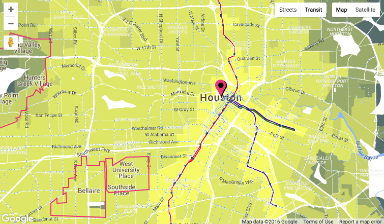
The Center for Neighborhood Technology envisions the database as a resource for researchers, advocates and residents, as well as elected officials and businesses, who can analyze the data and create their own visualizations, like the one below. Article continues after map.
That debate aside, the influence of light-rail can be seen in maps like the one that plots population near AllTransit's high-frequency transit. It mirror not only to the light-rail lines but also to the phenomenon known as the "arrow" on the west side of town where a concentration of wealthy, white people live.
Indeed, of the 421,382 residents who live within a half-mile of the database's definition of high-frequency transit, 151,729 of them are white, according to AllTransit. That’s compared to 144,879 Latino residents and 82,013 African-American residents. Maps showing each population reveal which lines reached the highest number of residents by race.
The database creators say they expect that sort of information to help inform policy and be of use to transit advocates, urban planners, and journalists. Learn more about the database here.