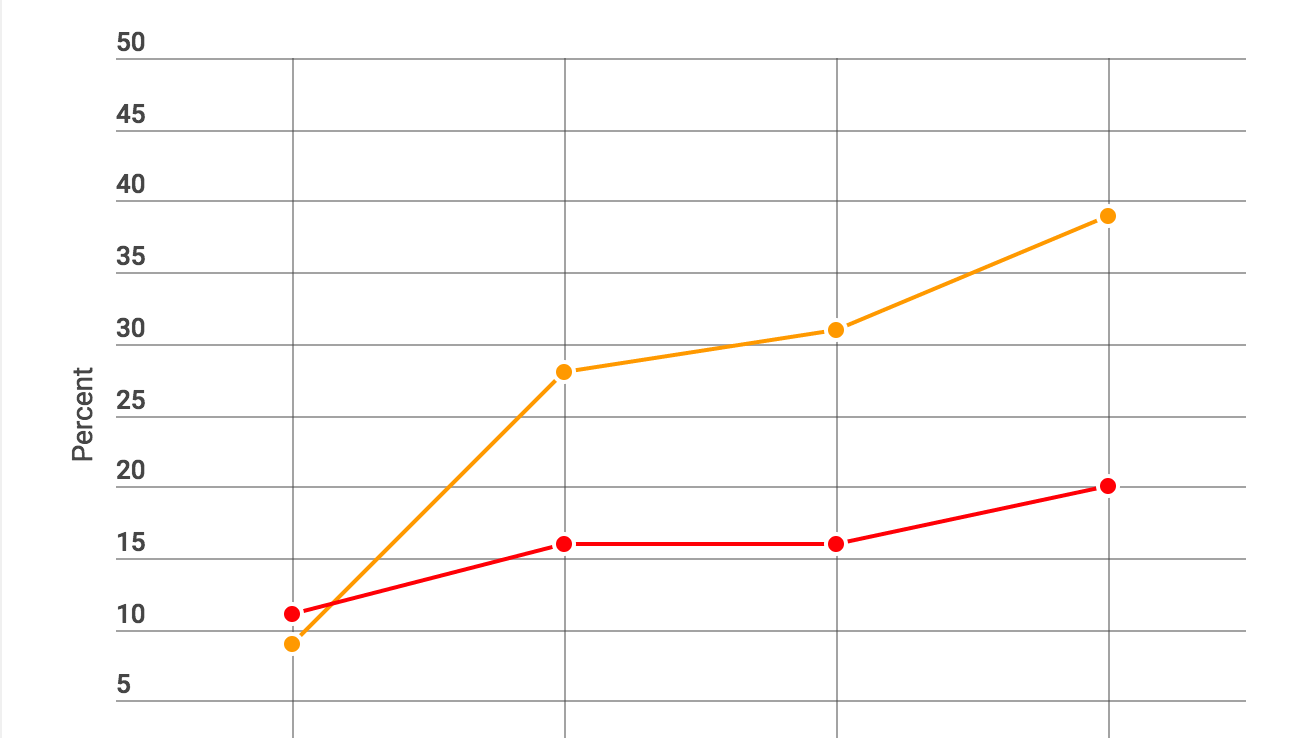
The chart below shows a stunning trend unfolding in Houston. And it has big implications for the way we think about the region that -- at least until recently -- has been seen as an economic juggernaut and perhaps a model for cities in the U.S. Sun Belt.
One way we can examine an area -- whether it's a city, a county, or a country -- is by looking at the overall characteristics of its population.
In Harris County, which surrounds Houston, we see a troubling trend: Poverty is on the rise. The poverty rate here increased from 10 percent in 1980 to 17 percent today. But that only tells us part of the story about how the region is shifting.
Another way to study a place is by looking at the characteristics of its individual communities. That's what the Kinder Institute did in its new study of Harris County. The results are concerning.
Today, 39 percent of the census tracts in Harris County are classified as "high-poverty." Within a high-poverty tract, at least 20 percent of households have incomes below the poverty line.
The figure is staggering for two reasons. First, it’s almost double the national rate. Second, the figure has grown quickly, more than quadrupling since 1980. To be clear, the number of high-poverty tracts is growing nationally, too. But they’re not growing nearly as fast as they are here.
So in Houston, the issue isn’t simply that poverty is on the rise. It’s that poverty — once largely confined to the core of the city — is spreading across the area and transforming places that were once middle-class.
Notably, Houston is currently in the midst of an economic downturn. But these trends pre-date the current economic slide of the last two years. Overall, as Houston’s economy has thrived, not all communities have benefited. And in fact, many have suffered.
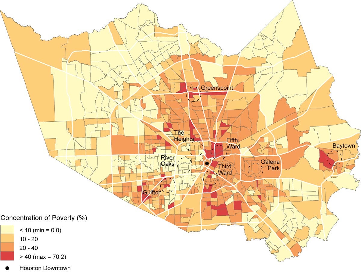
So where, exactly, is poverty spreading? The maps below show where high-poverty areas have emerged over the last three decades. They’re largely in areas that were previously middle-class.
In 1980, high-poverty areas were confined within or just beyond the core of the city, known as the Inner Loop. But today, high-poverty areas have crept well beyond that boundary, and those high-poverty neighborhoods dominate much of the area between Houston’s two beltways, except for a wealthy strip on the west side of Houston. These high-poverty areas largely supplanted areas that were considered middle-class in 1980.
The maps below tell the story visually. Back in 1980 — the second map — the faintest shade of yellow dominates the picture, indicating most tracts had a poverty rate of less than 10 percent. There are some areas with higher levels of poverty within the boundaries of Beltway 8 (the second loop around the region’s core), but there’s still plenty of that faint yellow color. It’s only in the very center of the map that we see red tracts, indicating the most concentrated poverty.
Today the faintest yellow is only on the very periphery of the county and on a band that extends westward from the city core that is home to the region’s wealthiest residents. Dots of red are seen throughout the area, often far from downtown. And the orange, indicating poverty levels in excess of 20 percent, is also present in many areas up to Beltway 8 and beyond.
Poverty Concentration in Harris County Census Tracts, 2010
Poverty Concentration in Harris County Census Tracts, 1980
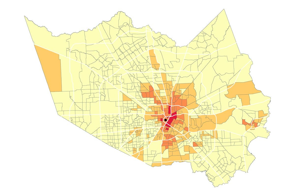
All told, nearly a third of Harris County’s census tracts transitioned from having low poverty rates to high poverty rates from 1980 to 2010. And all of this happened at a time when the region’s population boomed and the Houston area emerged as an economic powerhouse.
There’s a third trend that’s important to understand as well.
The county’s wealthiest areas are increasingly becoming economically homogenous. In other words, it’s rare to find low-income residents in areas where the wealthy live. The wealthiest parts of the region are self-segregating and becoming increasingly isolated from the rest of Houston.
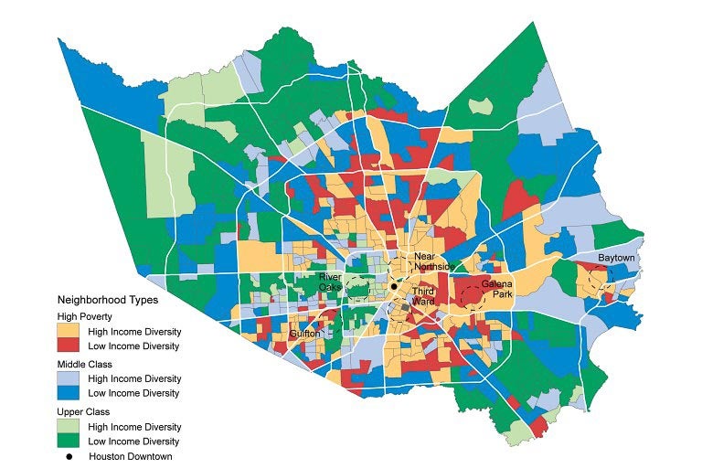
The final set of maps underscores this point. They show two sets of information: whether a tract is high-poverty, middle-class, or upper-class, and the level of diversity of incomes among households in those tracts.
Class and Income Diversity of Harris County Census Tracts, 2010
Class and Income Diversity of Harris County Census Tracts, 1980
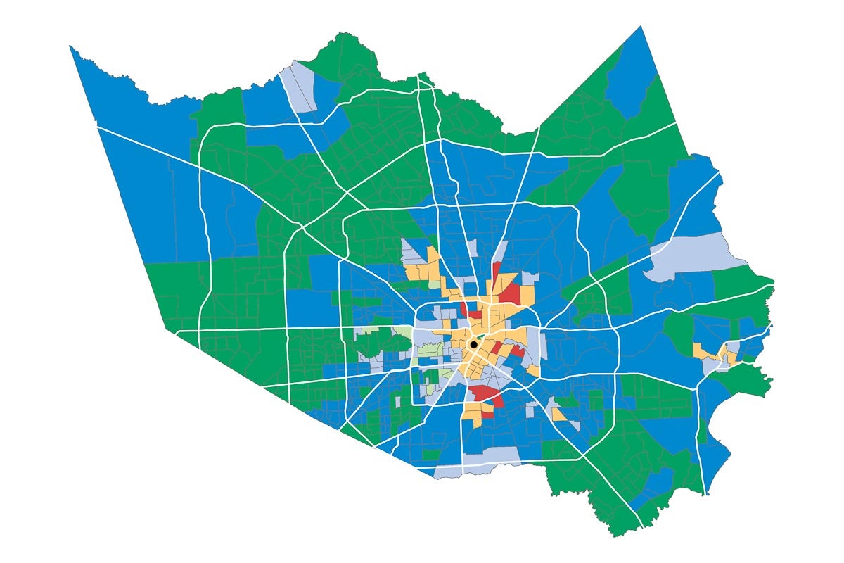
In the first map, which shows the present condition, the most economically diverse neighborhoods are high-poverty areas directly north and southeast of downtown. Meanwhile, residents’ incomes are more similar toward the edges of the county in middle- and upper-class areas. That suggests income diversity is most likely in areas with elevated poverty, rather than in wealthier neighborhoods.
The maps also show another trend. Compared to 1980, it’s clear that today, there are more neighborhoods with households that have a diverse range of incomes. That, in and of itself, might seem like a hopeful trend. But what’s likely happening here is that increased income diversity is due to previously middle-class neighborhoods transitioning to a high-poverty status, not poor people moving to areas that might have previously been inaccessible.
The middle class — which once dominated the western half of Houston’s Inner Loop — has been supplanted from that area by the upper-class. Meanwhile, the middle-class regions that were in place between Houston’s two beltways are largely gone too, replaced by high-poverty areas.
Overall, economic segregation is tightening its grip on Harris County. A map that was once largely blue has seen that color fade away. The result is a region with a smaller middle-class, a starker division between “haves” and “have nots,” and few indications that the trend is poised to reverse any time soon.

