

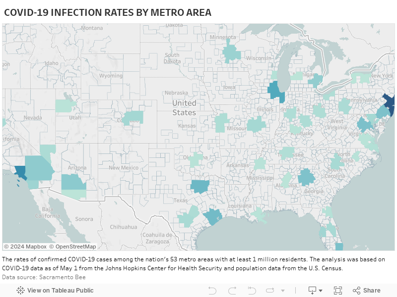
Last weekend, the Sacramento Bee published an analysis of COVID-19 infection data from the nation’s 53 largest metropolitan areas, all of which have a population of over 1 million. The seven-county Sacramento-Roseville-Arden-Arcade Metropolitan Statistical Area (MSA) had an infection rate — cases per 100,000 — of 62.1, the lowest among the country’s largest metros. It was a “surprise finding,” according to the Bee reporters who wrote the story.
This post is part of our “COVID-19 and Cities” series, which features experts’ views on the global pandemic and its impact on our lives.
Around 2.3 million people live in the Sacramento metropolitan area.
The metro areas with the highest infection rates were New York (2,000.3 per 100,000 people), New Orleans (1,283.8), Boston (1,008.7), Providence (718.5) and Detroit (713.3). Those areas’ populations range in size from the largest, New York-Newark-Jersey City, to two mid-size (Boston-Cambridge-Newton and Detroit-Warren-Dearborn) and a couple with some of the smaller populations among the top 50 MSAs in New Orleans-Metairie and Providence-Warwick.
The Houston metro area was No. 30 on the list with an infection rate of 135.3 — far lower than many others but still the highest of Texas’ largest metros. Rates in Dallas-Fort Worth and Austin-Round Rock were similar at 105.4 and 103.8, respectively. San Antonio-New Braunfels had the second-lowest infection rate on the list at 63.7.
When looking at COVID-19 deaths per 100,000 residents, all four of Texas’ large metros were among the bottom 10 in the nation. Dallas-Fort Worth was No. 45 with 3.1 deaths per 100,000, Austin was at No. 46 with 3.0, Houston was No. 49 with 2.8 and San Antonio was No. 52 with 2.4.
Metro areas and coronavirus
In addition to Sacramento and San Antonio, Tampa, Florida; Portland, Oregon, and Raleigh, North Carolina had the lowest rates of infection. In the Sacramento Bee article, a correlation was drawn between the low infection rates in these areas and their relatively low levels of density: “Each of those areas has density in urban cores but also has a considerable population base in suburban areas where detached, single-family homes are the norm, giving residents more elbow room.”
The similarities described among the cities above are true for many of the nation’s metropolitan statistical areas.
In general, MSAs comprise a central city or county with a large population along with the cities, counties and communities that constitute the surrounding suburban and exurban areas. The populations of which rely heavily, but not entirely, on the job centers, health care facilities, universities and entertainment venues found in the central county or city.
In the case of Houston/Harris County, there are suburban cities such as Pearland, Sugar Land and The Woodlands, as well as counties like Fort Bend, Galveston, Brazoria and Montgomery.
It’s a symbiotic relationship and the entire region benefits from the success and strength of cross-sector regional alliances. Though, in the past few decades, politics has driven a wedge between large cities and the adjacent suburban and rural areas, weakening what advocates like late urban affairs writer Neal Peirce saw as metropolitan regions’ ability to improve life for everyone.
No simple answers
Density, of course, has been a very popular topic throughout the pandemic, as has the urban versus suburban discussion. Will the pandemic result in a large number of people fleeing large cities? Are cities to blame for the pandemic? Are suburban and rural areas safer?
Like many questions related to the coronavirus pandemic, there are no simple answers. Early on, it may have seemed that rural populations were at a lower risk, but that now it seems the disease may be shifting from urban to rural areas, which often don’t have the hospitals or health care resources to handle a surge in patients. Rural areas also tend to have older populations with higher rates of preexisting conditions.
Making the wrong comparisons
Joe Cortright of City Observatory recently wrote about the benefit of urban-suburban solidarity as it relates to the COVID-19 pandemic, which “doesn’t respect political boundaries within metro areas.”
In his article “Why suburbs aren’t safer from the pandemic than cities,” Cortright argues that in trying to understand the role of population density in the spread of COVID-19, many data analyses are comparing reported cases of metropolitan central cities to other central cities and suburbs to suburbs, which would seem to be comparing apples to apples. But, he says, “it makes little sense to combine data from all suburbs (whether they’re in hard-hit New York or Detroit) with data from suburbs in metro areas where the virus is far less prevalent (say Minneapolis or San Antonio). And the same can be said of central cities.”
Instead, in looking at the pandemic in cities versus suburbs, the rates of cases in a metro central city should be compared to the rate of cases in the surrounding suburbs and counties.
Cortright writes:
Keep in mind that these are contagious diseases after all, and contagion thrives on interaction. Cities are connected both globally (to other cities around the world) and locally, to their own neighborhoods and to surrounding suburbs and countrysides. Once established, the primary transmission of the virus is highly localized. The significant variations in prevalence are not between cities and suburbs within a metropolitan area, but rather among metropolitan areas.
Suburban counties in about 40 percent of large metros have higher rates of reported cases per capita than in the central cities of 40 percent of metro area.
Many suburbs have rates higher than central cities; on average suburbs are less than a week-behind their center cities in cases per capita.
What this means is that it really matters much more whether you live in a metro area with a high incidence of Covid-19 than whether you live in a city or a suburb.”
According to the latest data from the New York Times, the number of cases per 100,000 residents in Harris County was 160. In other Houston MSA counties, the numbers were 205 in Galveston, 180 in Fort Bend, 173 in Brazoria, 124 in Montgomery, 117 in Chambers, 74 in Waller, 59 in Liberty and 47 in Austin.
The data-driven pandemic
As more states like Texas relax restrictions on businesses and allow stay-at-home orders to expire, many raise concerns that people will let down their guard, allowing a second wave of infections to erase the progress made in slowing the spread of COVID-19.
Coronavirus-related data such as numbers for positive tests, negative tests, total tests and tests available per 1,000 residents, information on provider resource capacities such as hospital beds and active physicians per 1,000 residents by state, rates of uninsured, deaths, patients hospitalized, ventilator shortfalls and hospital beds occupied.
This information impacts what experts know about the disease and its spread, as well as the decisions local, state and national governments make in response to the outbreak. With all of this and more on the line, it’s important that the data and evidence that are the basis of these decisions are as complete and accurate as possible. And, unfortunately, that’s been a problem during the pandemic.
The lack of testing, reliability of testing and the absence of any standardized approach to testing from state to state — all of which affect the ability to understand COVID-19 in the past, present and future — have been widely reported.
However, as Joe Cortright points out, there are some things that are known: “Covid-19 is a disease of hotspots. And understanding where the hotspots are (and where they were 6 days ago) is an essential ingredient in ascertaining who’s most at risk, and using our all too scarce diagnostic and treatment resources to the greatest effect.”