

Poverty, income, race -- in Houston they take a familiar shape. On almost any map that plots some form of wealth, a familiar arrow takes shape over the Energy Corridor, Memorial and River Oaks, pointing east toward downtown.
This is the area of town that is whiter, wealthier, and better connected to transit, jobs and other urban amenities. And in almost every analysis of Houston, it shows up. Above is the basic idea, displayed as median incomes across the city, from our Disparity Atlas, published earlier this year.
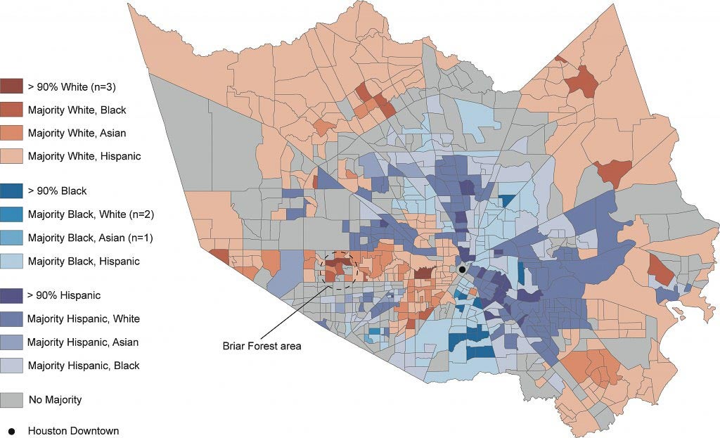
And although Houston is often criticized for its economic segregation, the vestiges of being a bi-racial city in the South -- coupled with modern disparities -- also reveal a racial component to where Houstonians live. The map below, from our Shifting City report, shows the breakdown not only in terms of which racial and ethnic group makes up the majority of a given census tract but which is the second-most populous in order to determine how integrated Houston, the country's "most diverse" metro area, really is. The findings from that report complicate what diversity on a large-scale really means:
- Majority-Hispanic neighborhoods are likely to have whites or blacks as the second-most populous group in the area.
- Majority-white neighborhoods are likely to have Hispanics as the second-most populous group. It’s unlikely blacks will be the number two group in a white neighborhood.
- Majority black neighborhoods are likely to have Hispanics as the second-most population group. It’s unlikely that whites will be the number two group in a black neighborhood.
With that in mind, it's time to take a look at some of the numbers behind Houston's boom. As Houston continues to boom and apartment towers rise around downtown, how is that growth being spread across the city? Not evenly. Our Houston In Flux report looked at construction and demolition permits across a ten-year period in Harris County and found which communities topped county-averages in each category and which were high turnover areas with lots of both. On the other end of the spectrum, some older and well-established communities showed little movement either way, which could be a sign of either stability or neglect. The trends also pointed toward Houston's future:
Although building proliferated alongside highway projects on the periphery of the region, the rising premium on land located in and around employment centers motivated property owners and developers to demolish existing structures in order to make room for new types of construction. In some cases individual homeowners replaced mid-century, post-war houses with larger, grander homes. In other cases, real estate developers tore down shotgun houses, craftsman homes and obsolete industrial buildings to erect townhomes, mid-rise apartments and denser forms of urban living.
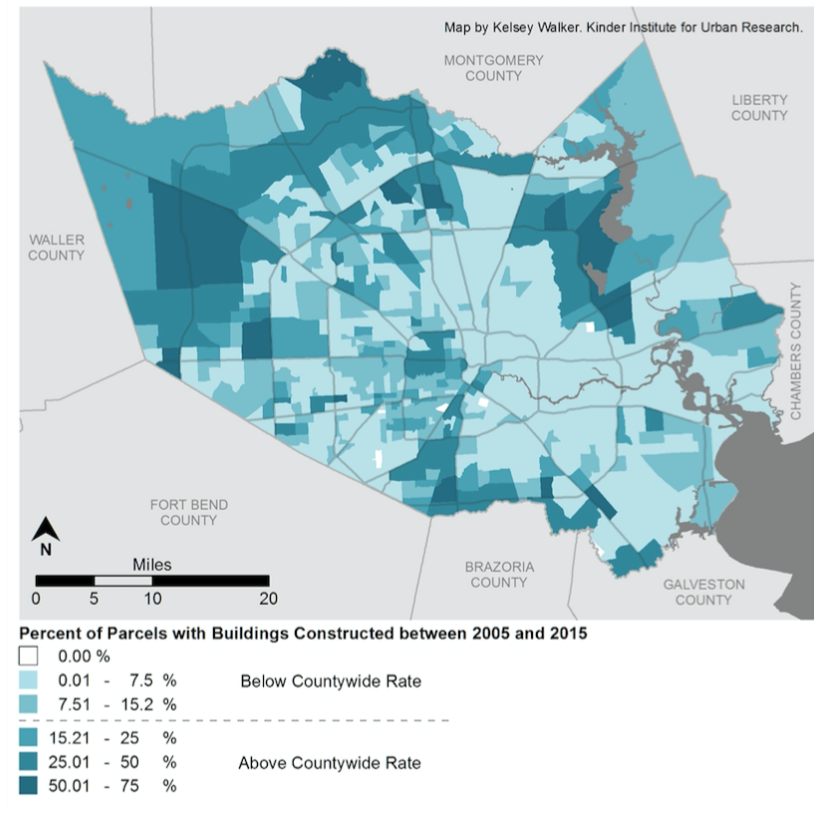
In Third Ward, for example, a high number of demolitions linked with the construction of townhouses, revealed the community's vulnerability to gentrification, which community organizations are working to manage.
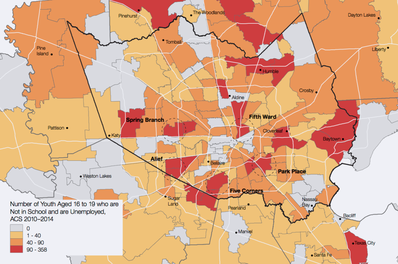
As inner-loop real estate heats up, Houston is experiencing what many urban areas across the country are seeing: the suburbanization of poverty, presenting new challenges for communities that often lack infrastructure like a robust public transportation system. It also means that service providers may need to reorient themselves. One example of this can be seen from our Opportunity Youth report, which tracked young adults ages 16-19 who are not enrolled in school or employed. Many of the areas with the highest number of these so-called "disconnected" or "opportunity youth" are outside the loop, challenging stereotypes about "inner cities."
Another example of the suburbanization of poverty comes from our Disparate City report. Looking at poverty rates by census tract across the county, researchers found that not only has poverty increased but it has become more concentrated as the wealthy have become more segregated. The concentration of poverty, along with the suburbanization of poverty, is one of the biggest challenges metro areas face today. In Harris County, the problem is particularly acute. From 1980 to 2010, the percentage of high poverty census tracts in Harris County more than quadrupled to 39 percent, which is nearly double the national rate of 20 percent. The researchers also found that "high poverty areas, largely confined to within or just beyond Houston’s Inner Loop in 1980, have since emerged in the areas beyond the Inner Loop ... These high poverty areas largely supplanted areas that were considered middle class in 1980.
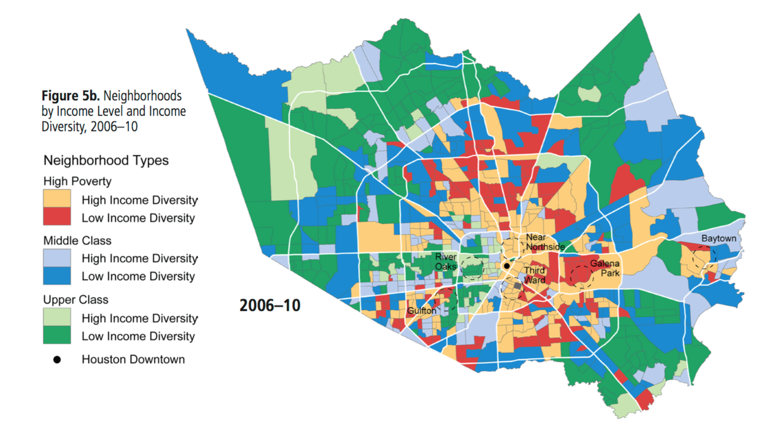
The report presents a troubling trend that threatens to increase disparities at the neighborhood level going forward. One thing that has remained constant -- the segregation of Houston's arrow.