Editor’s note: This post originally was published in the City Observatory and is republished here with permission. The opinions expressed in this commentary do not necessarily reflect those of the Kinder Institute for Urban Research or its staff.
The harsh and largely unforeseen reality of Coronavirus has changed everyone’s daily lives, and promises to be a major disruption for months and years to come.
Covid-19 is a contagious viral disease, its spread by close and direct contact between humans. It started in Wuhan China late last year, and spread rapidly throughout China in the aftermath of the lunar new year celebrations, with thousands traveling to or from Wuhan.
What do we know about the geography of Covid-19?
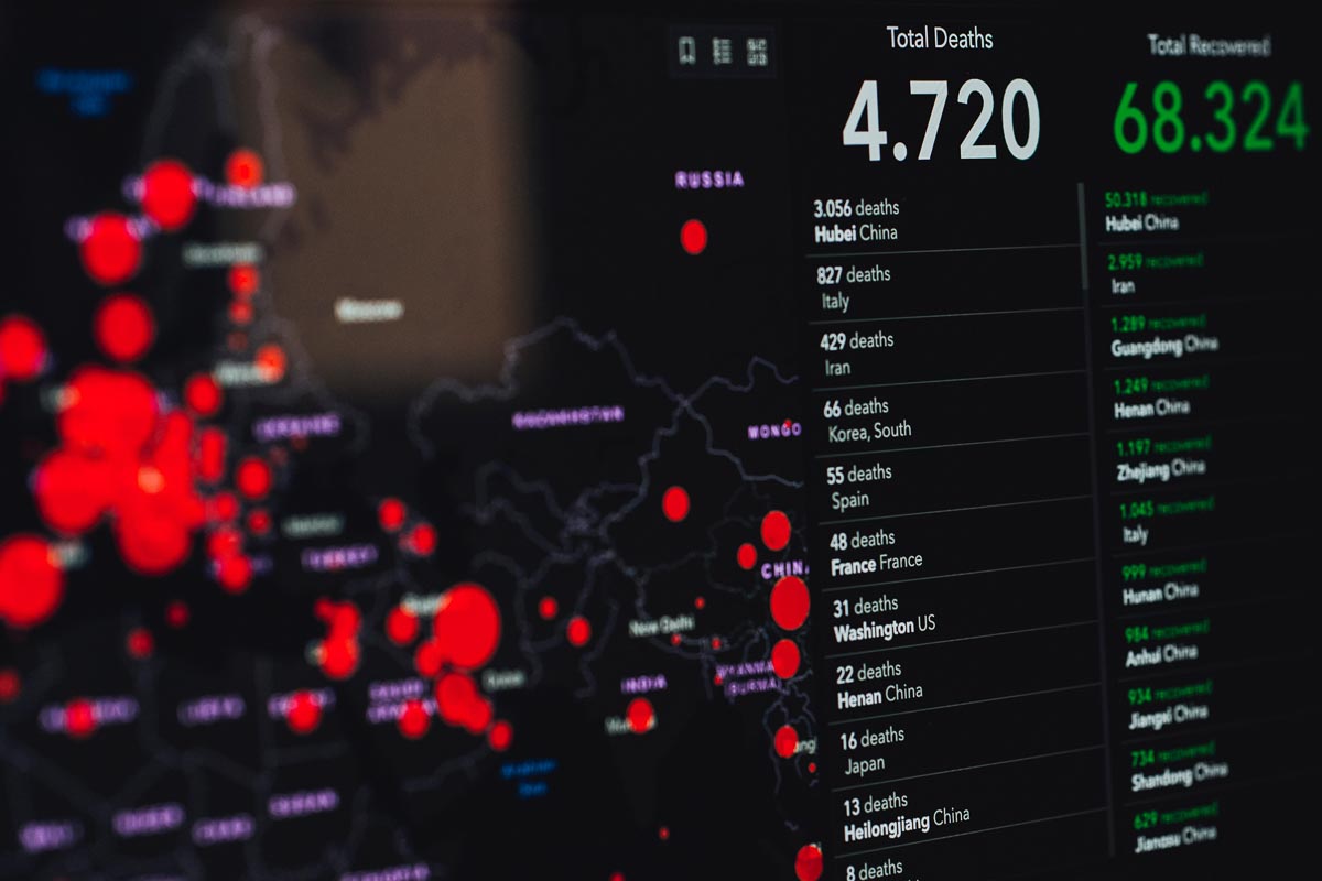
What we find disappointing so far is the crude geography of most of the maps of Coronavirus in the US. The real geography is not that of states, or counties, but rather the particular locations–the homes, businesses, hospitals, hotels, restaurants, airplanes or cruise ships, where infected people interacted directly with the previously unaffected. These maps would provide a much more useful and accurate picture of the geography of Covid19 if they were dot maps on a fine geography.
We know this kind of picture can provide essential insights on disease. More than 150 years ago, in perhaps the canonical instance of geographic epidemeoology, John Snow mapped the location of cholera cases in London, and quickly deduced that a particular well was the source of the outbreak.
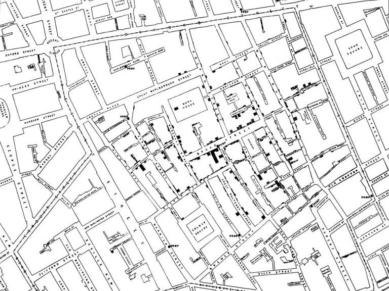
London, 1856. It’s 2020. Where is this map for Covid-19?
None of the maps published, for example, by the New York Times, show this level of detail. And for the most part, this map, with circles scaled to the number of cases, mostly resembles a map of the nation’s largest metro areas.
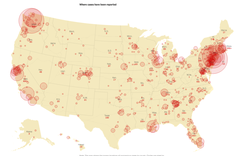
Map from the New York Times showing coronavirus cases in America. Source: The New York Times
A similar map prepared by the World Health Organization, aggregates data at the country level.
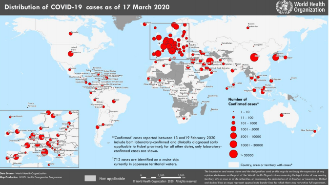
Source: World Health Organization
In a way, the most helpful information in the New York Times is the list of the locations or sources of transmission of the largest number of cases. These hotspots help us visualize where the disease has had its largest impact. The clusters in New Rochelle and in a Seattle area nursing home are apparent, as are the outbreaks in cruise ships.
Covid-19 is a disease of hotspots. And understanding where the hotspots are (and where they were 6 days ago) is an essential ingredient in ascertaining who’s most at risk, and using our all too scarce diagnostic and treatment resources to the greatest effect.
The incidence of Covid-19 in US States and Subnational regions in China, Italy and Canada
The reason a finer geographic fix on the progress of the virus is so important is underscored by looking at the incidence of Covid-19 in US states, Canadian provinces and Italian regions. China’s one and a half billion people live in 34 provinces; America’s 330 million people live in 50 states (and the District of Columbia). These are generally the finest subnational geographic units for which data are available. We’ve used WHO data for Chinese provinces and Johns Hopkins University data for US states to compute the incidence of Covid-19 in cumulative cases per 100,000 population as of mid March (Chinese data are for 12 March, Canadian and US data are through 17 March). Italian regional data for 17 March are from Statista. Chinese provinces are shaded blue, US states are shaded orange, Italian regions are green, Canadian provinces are red.
Source: City Observatory
(To better show the differences between most states and provinces, we’ve truncated the scale at 20 cases per 100,000 population; the correct bar for Hubei province and several Italian provinces would extend far off your computer screen to the right, with more than 100 cases per 100,000 population).
This chart makes it clear how severe and widespread the virus has been in Italy. Lombardy reports the highest incidence of Coronavirus of any subnational region in our chart, with more than 160 cases per 100,000 population. Italian regions account for 13 of the 14 highest rates of coronavirus cases per capita among the four countries shown here. Alarmingly, the incidence of Covid-19 in eight states and the District of Columbia is already higher than in any Chinese province outside Hubei (the epicenter of the virus). The median incidence of Covid-19 in US states (.73 per 100,000) is already nearly as high as the median incidence of Covid-19 in Chinese Provinces. On a population-adjusted basis, the incidence of reported Coronavirus cases in Washington, Massachusetts and New York is currently higher than in Beijing or Shanghai. If anything, the US numbers may understate the extent of the virus, because so few persons have been tested due to a shortage of diagnostic capacity in the US. (The data underlying this chart, as well as charts showing non-truncated values for coronavirus incidence, and country maps of incidence rates are avaialable on our Public Tableau site.
This disparity is both a testament to the effectiveness of the the Chinese efforts to restrict travel and its social distancing measures, and also an indication of how much time the US has squandered; the disease first manifested in China in November; months before the first case in the US.
Chinese Cities and Covid-19
While the Covid-19 virus started in the city of Wuhan, it quickly spread to other provinces in China. Hubei province, which includes Wuhan accounts for 67,800 of the roughly 81,000 cases of Covid-19 reported in China, and for 3,056 of 3,173 reported deaths (data as of 12 March).
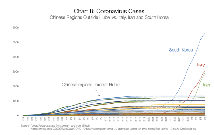
When you exclude Wuhan and its surrounding Hubei Province, which together account for 83 percent of all Chinese cases of Covid-19, the Chinese have done a remarkable job in making sure that the disease did not grow exponentially elsewhere: Here’s a chart from Thomas Pueyo, showing Covid-19 flatlining in every Chinese province outside Hubei after February 10.
And within these other provinces, the disease was also highly localized. The experience of Gansu province is instructive, and has been closely studied in a recent paper. Gansu province has a population of about 28 million, slightly more than Texas; at about 175,000 square miles, it is about two-thirds the area of Texas a well. The research paper provides some clear insights about the geography of the virus’s spread. The authors used GIS to map the locations of identified cases, and distinguished between initial and secondary infections.
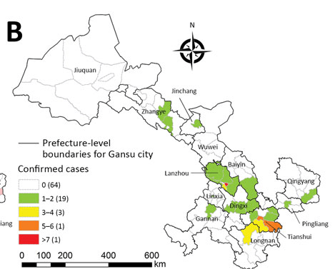
Gansu province coronavirus cases.
In Gansu province, nearly all of the cases were confined to the provinces largest cities, with few or no cases in outlying areas.
Our study demonstrates a significant spatial heterogeneity of COVID-19 cases in Gansu Province over this 2-week period; cases were mostly concentrated in Lanzhou and surrounding areas. LISA analysis findings are in agreement with the spatial distribution of COVID-19 at the county levels of Gansu Province. This analysis confirms that the distribution of cases was not random: hot spots were mainly restricted to the Chengguan District of Lanzhou, the most densely populated and most developed area. This case aggregation is closely associated with the development characteristics of Gansu Province, which is at the high end of economic, medical, population, and cultural development.
Again, unlike Hubei province, they had time to implement social distancing to limit the further spread of the disease.
For reference, as of 12 March, Gansu Province had recorded 127 cases and 2 deaths from Covid-19. For reference, as of 17 March, Texas had recorded 110 cases and 1 death.
Italian Cities and Covid-19
Outside China, the most severe outbreak of Covid-19 has been in Italy. As in China, while the infection has spread nationally, it is highly concentrated in a few hotspots in Lombardy. Here, health researchers have compared the experiences of two provincial cities, Lodi and Bergamo. The virus first struck Bergamo several days earlier, and consequently Lodi was able to implement social-distancing tactics earlier in the outbreak cycle.
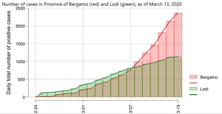
Number of cases of coronavirus in Province. Source: Jennifer Beam Dowd, Valentina Rotondi, Liliana Andriano, David M. Brazel, Per Block, Xuejie Ding, Yan Liu, Melinda C. Mills, “Demographic science aids in understanding the spread and fatality rates of COVID-19″ DOI 10.17605/OSF.IO/SE6WY
Big data and infectious disease
These two studies notwithstanding, there’s a paucity of geographically detailed information about the spread and intensity of the Corona virus. This seems like the ideal opportunity to deploy the much vaunted tech-driven big data infrastructure. Most adults in most developed countries (including China, Italy and the United States) have cell phones, and majority of these are smart phones. Both the cell network and various web-based apps track user location (through cell triangulation or device GPS or both). It is technically possible to use the location history of an individual device to track its users movements. Given the communicability of this disease, it seems like it would be useful to be able construct a dataset of the past couple of weeks of movements of those who have tested positive for Covid-19 to identify possible hotspots and paths of infection. This information might be helpful in prioritizing others with few or no symptoms to be tested as additional testing capability becomes available. We’re sensitive to the privacy concerns here, but its a long established protocol in the case of infectious diseases that the afflicted are expect to reveal to health authorities others they might have infected. In addition, the most valuable insights would come from aggregated data (i.e. identifying the common locations of multiple individuals) rather than data or specific only to a single individual.
Likewise, it seems like it would be of considerable value to researchers if CDC were to prepare a geo-coded database of the locations of persons diagnosed with the Covid-19 virus. Such data could be coded at a block, census tract or zip code level, to more narrowly identify the geography of the diseases spread, without disclosing the identity of any individual. Such data would make it possible to create much more detailed, informative maps than are possible with today’s highly aggregated data.
Cities are the absence of social distance
The particular irony of a viral disease like Covid-19 is that it is so closely related to a city’s core function: bringing people together. The flourishing civic commons that brings people from all over China to xxxxx for the Lunar New Year, or which makes cities like Seattle closely connected to a global community, are exactly the characteristics that expose them to greatest risk. (It’s little surprise that West Virginia is the last US state to be infected with Covid-19.) The strength of cities emanates from the fact that ideas, like viruses, spread easily in a dense urban environment.
The response to Covid-19, social distancing, is a signal opportunity to visualize what the absence of these connections does to our daily lives. When we can quickly, easily, frequently and serendipitously (and safely) interact with other people, the productivity and joy of urban live shrivels immediately. When cities work well, its because, in all their spaces, they overcome or bridge social distance. That’s true whether we’re talking public spaces and the civic commons, like parks and libraries, or whether we’re talking the nominally private spaces where we socialize and interact with others (bars, restaurants, workplaces). The reason we find social distancing so difficult, and so off-putting is that it runs counter to so much of what makes life, especially city life, worthwhile.
The Corid-19 outbreak, and our collective response to it are evolving quickly, and this post will be updated as our knowledge of the pandemic becomes clearer. Comments, additions and corrections are welcome. This commentary was originally posted at 9:52pm Pacific Daylight Time on 17 March 2020, and updated a 1:20 pm Pacific Daylight Time on 18 March 2020.

