
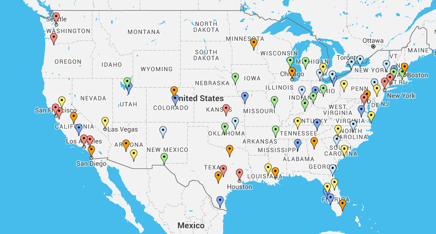
The map below shows how cities rank by a measure known as the "Commuter Stress Index."
The measure, compiled by the Texas A&M Transportation Institute, works like this.
Researchers compare how long it takes to travel the most-popular routes at peak travel times against how long those routes would take when roads aren't congested.
If a city has a Commuter Stress Index of 1.0, for example it means that there essentially is no rush hour. Travel on peak routes at peak times doesn't take any longer than usual driving. If it has a Commuter Stress Index of 1.62 (like Los Angeles, the most "commuter stressed" city), then during rush hour, the most popular routes take 62 percent longer than they do during off-peak times.
The data below applies to 79 metro areas in the United States that have populations of at least 500,000.
View Who Has the Worst Commutes in a full screen map
Unsurprisingly, the largest areas tend to have the worst commuter stress. But there are some notable exceptions to that rule. Honolulu ranks third on the measure, even though the area's population is only 845,000. There, the index is 1.53. On the other hand, St. Louis is a large metro area with more than 2 million residents, but its index ranks among the best at just 1.19.
Though Houstonians frequently complain about traffic, their congestion index only ranks 13th on the list.