
“Uneven Runoff”, a new digital mapping project for the Diluvial Houston Initiative, based at the School of Humanities at Rice University, examines urgent relationships between industrial water pollution and flood risk in Harris County. The project combines layers of data including flood risks, drainage types, industrial chemical releases and Superfund environmental cleanup sites to call attention to problems throughout the community—as well as their relationship with urban disparity at large.
The Urban Edge spoke with lead researcher Amelyn Ng about the project, which includes an ArcGIS StoryMap and interactive web-map to allow neighborhoods to explore nearby risks. The interview has been edited for clarity and length.
Urban Edge: How did this project come about?
We were interested in developing a project that could use mapping not just as a technology of top-down analysis, but also as a way to engage community organizations—such as the Texas Health and Environment Alliance, which we got to know and work with throughout the process—and to have maps act in more of a narrative fashion. The project would not have been possible without co-researchers Rae Atkinson and Michael Wissner, who contributed significantly to this new endeavor.
The project really kicked off when we discovered how much publicly available reporting data the EPA had available, on Toxic Release Inventory facilities and Superfund sites . But we never had seen a visual, spatialized version of all that data put in context. For us, mapping had the potential to spatialize this information, and to create a useful, accessible platform for researchers and community groups.
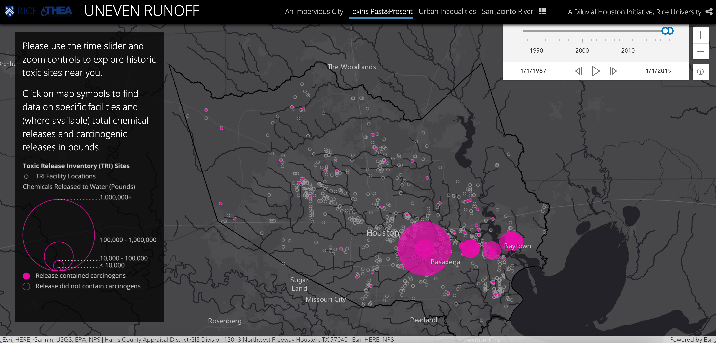
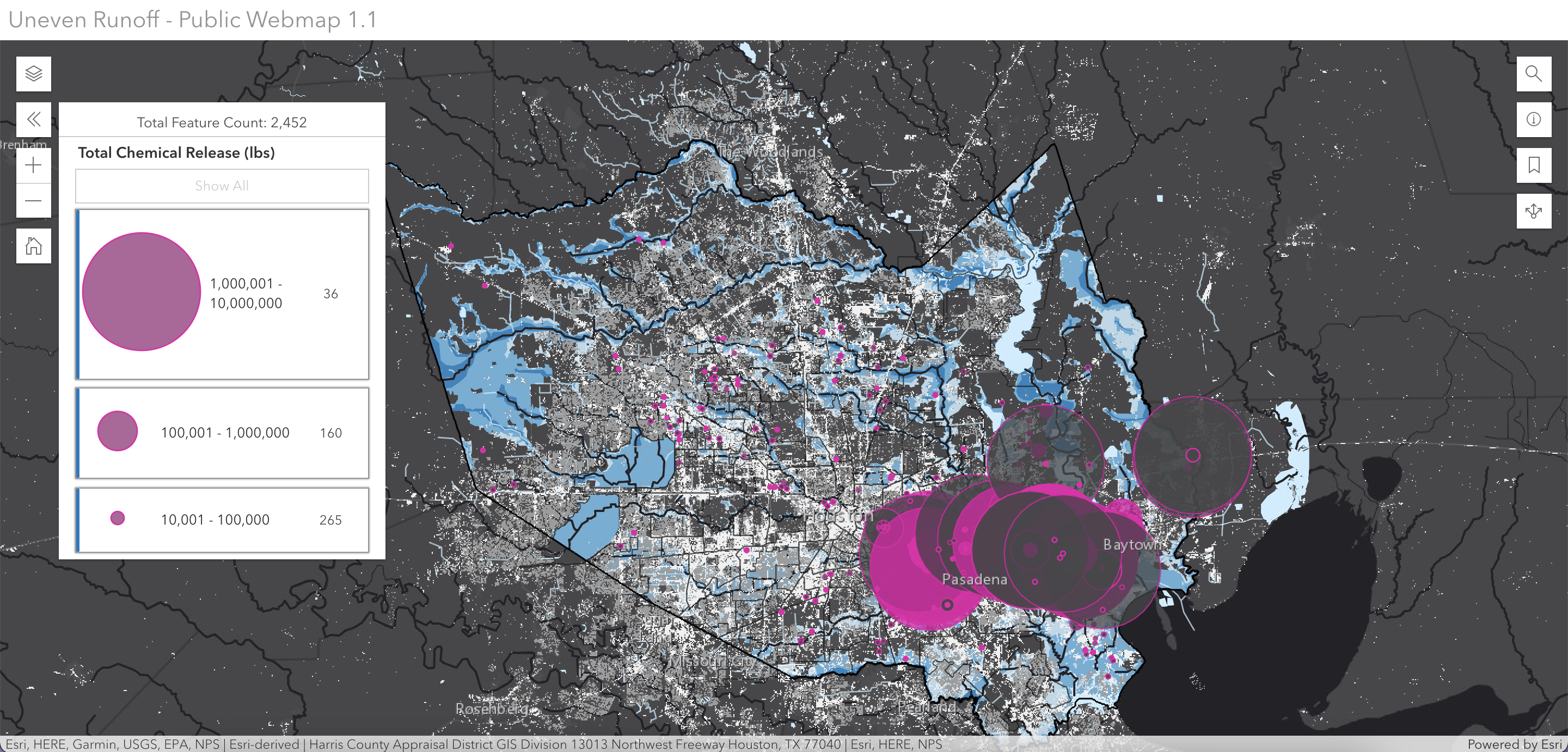
A map plots the magnitude of chemical releases over time, according to Environmental Protection Agency reports. (Courtesy Amelyn Ng, Rae Atkinson and Mike Wissner)
How did you go about finding a story to tell?
That’s where our partnership with THEA and their community members really came in. There was no way we could have learned what was happening on the ground without speaking to residents.
THEA helped us connect with residents of San Jacinto River communities, Fifth Ward, and the Cypress/Jones Road communities. We shared our preliminary maps with them and asked, “Is any of this relevant? What do you think?” And residents started to share experiences and observations of toxicity-related issues we had not considered in our maps: for example, illegal dumping in open ditches in the Fifth Ward, or the proximity of fishing and public recreation spots along the San Jacinto River to a superfund site where a dioxin plume was detected. Our meetings with these three groups sort of became “chapters” in our StoryMap. It added a qualitative dimension that could be considered a form of witnessing.
Bringing the voices of residents into the map is important, because it very much reframed the scale of the narrative that we could tell. As you might see in the section on drainage types, there are quotes by a Channelview resident or a resident about their open-ditch conditions, which really contextualized a lot of the abstractions that a map might otherwise bring.
Since all of the data existed and was already in a sense “known” and documented—what did this project discover?
It clearly demonstrates the magnitude, regularity, and precarity of these environmental hazards. Flooding and contamination are not one-off, random, or individual incidents. They are actually part of a systemic inequality of industrial pollution.
It identified a need for a further investigation into these industrial-related risks and flood risks intermingled with toxicity risks and how they disproportionately burden specific communities. That’s an entrenched problem that residents can trace back decades.
The StoryMap also brings some forgotten history back to the forefront … there is a kind of “climate amnesia” like the kind documented in Jim Elliott’s “Sight Unseen” but for these formerly toxic (and potentially still toxic) relic sites that get built over and no one has any idea. For example, we tiled the 25 active or inactive Superfund sites in Harris County and overlaid the extent of FEMA 100-year and 500-year flood plains on them. And then we then overlaid the Hurricane Harvey estimated flood level model (provided by the Spatial Studies Lab)—and you see these sites presentare at a much greater risk of flooding.
The other thing that we found was the great "leakiness" of toxicity. We decided to map toxic releases, from facilities—not by census tract or property borders, because toxicity knows no borders—but by waterway. In one section of the map you’ll see Harris County’s streams and waterways highlighted in colors showing the intensity of chemical releases that have cumulatively occurred there.
In addition to mapping that, we also looked at how toxic releases could be mapped temporally. Withmore than 30 years of release data from the EPA, 1987 to 2019—can you believe nothing was documented pre-1987?—Rae developed a temporal map with a time slider, so that the viewer can “play” Harris County’s toxicity over time. “Bubbles” of yearly chemical release data ripple across the map, scaled relative to the amount released in pounds. If you click on a bubble in any given reporting year, it also tells you which industrial company contributed to that release, whether it is in a FEMA flood zone, and how much of it is carcinogenic. A map like this helps describe recurring patterns of water contamination, both in space and over time.
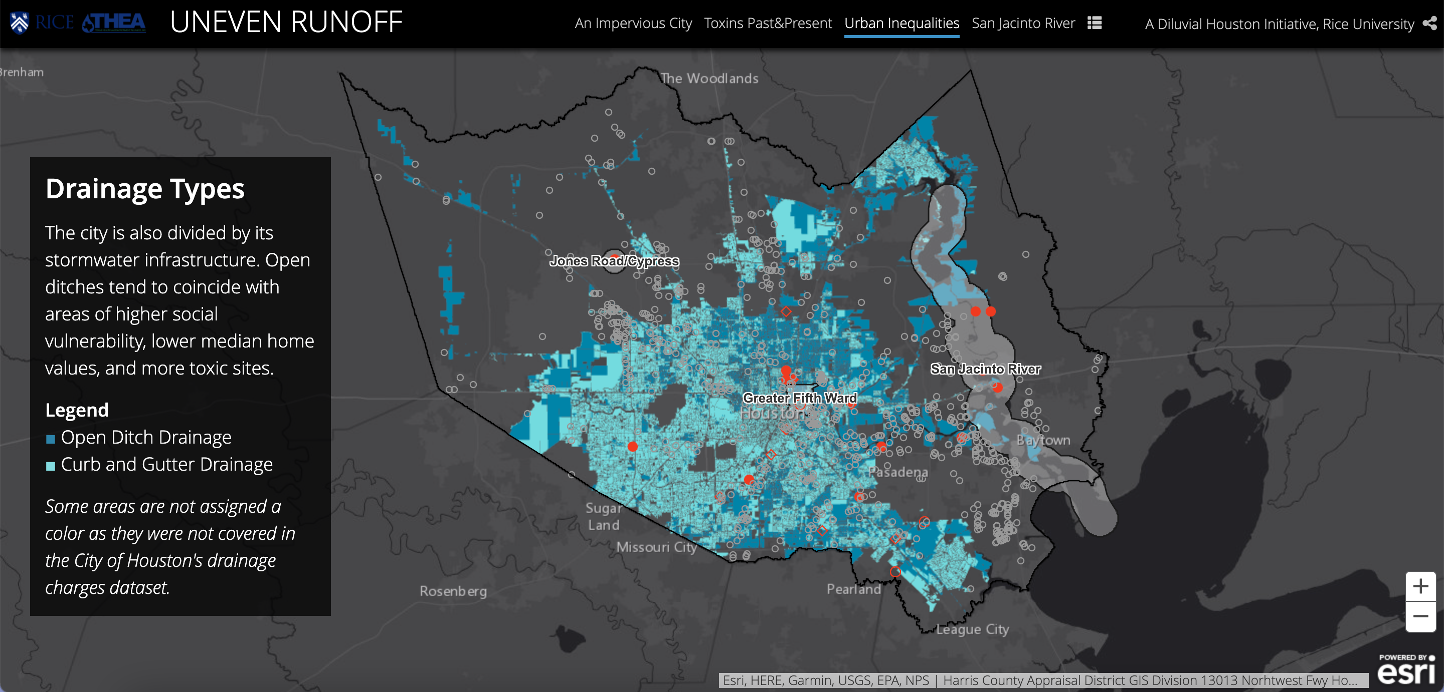
The project also examines neighborhood drainage types—such as curb and gutter versus open-ditch—across the county. (Courtesy Amelyn Ng, Rae Atkinson and Mike Wissner)
What does the project tell us about drainage systems?
Drainage disparity is significant. When we overlaid social vulnerability maps to other demographic maps, it not only told a story about drainage inequality, but also how industrial facilities are set up not randomly across the county, but very close to waterways and very close to lower-income neighborhoods, with higher minority populations.
It speaks to the degree of infrastructure investment in communities but also brings to mind the potential for exposure to toxicity during a flood event. While an open ditch in the Houston Heights may be seen as an example of “green infrastructure,” perhaps, but it’s relatively safe from contaminants. That same ditch along a Fifth Ward residential street, near an active or former industrial site, could be a conduit for toxic exposure. As residents pointed out, trash from other neighborhoods has also been illegally dumped in their ditches, and municipal ditch maintenance is few and far between. So a drainage type that may work in one neighborhood may not guarantee equal outcomes in another.
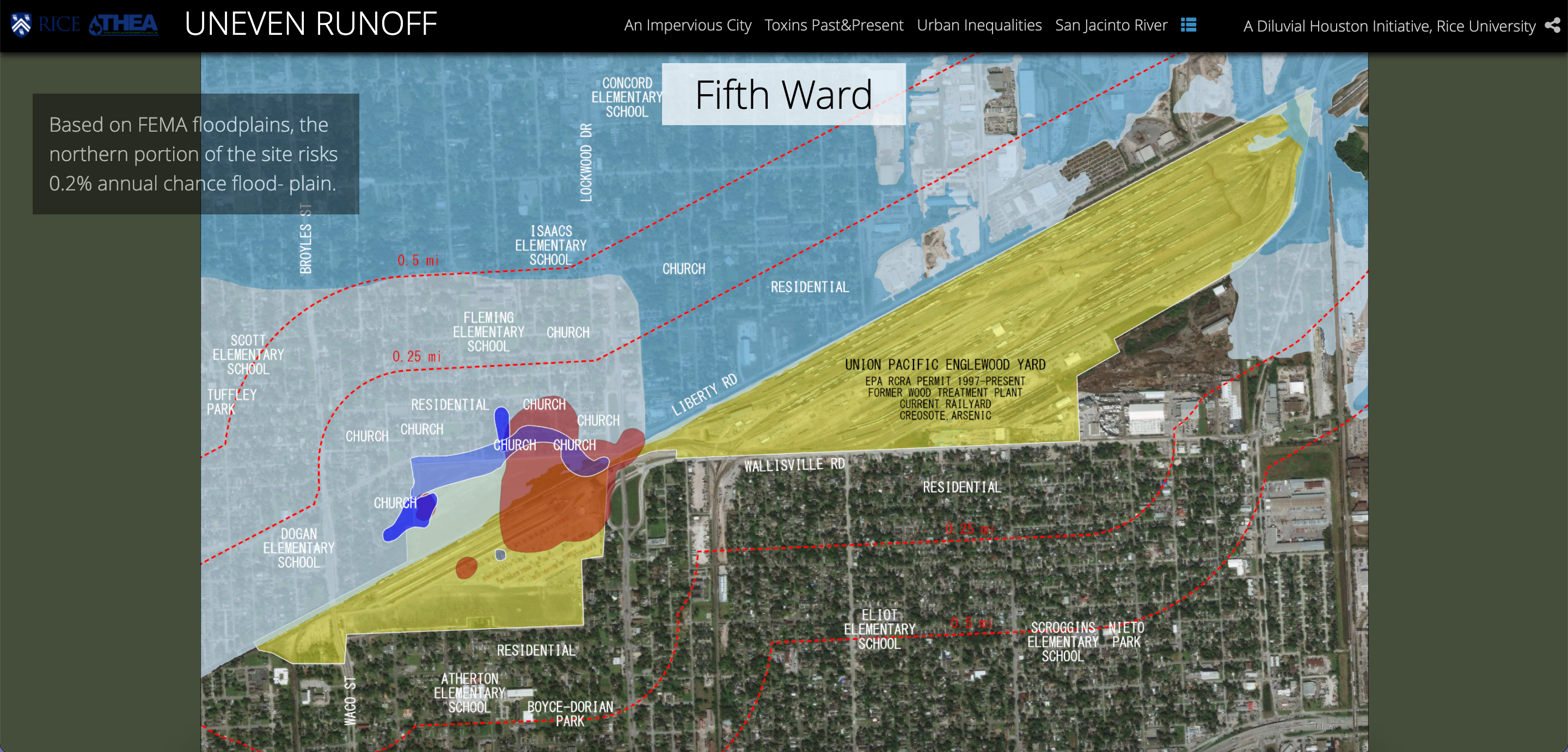
A closer examination of Fifth Ward demonstrates the proximity of toxic underground plumes, residential areas and flood plains. (Courtesy Amelyn Ng, Rae Atkinson and Mike Wissner)
What could be done to address the problems—are we talking about retrofitting drainage or something bigger?
Because it's such a systemic and long-term problem—a slow environmental violence, a response that takes the long view of environmental justice, rather than just a one-off fix, is warranted. This would involve asking residents what they want to see change. In our discussions with San Jacinto Area communities , one resident asked: why can’t the city regulate industrial land use or minimum distances between industrial developments and residential neighborhoods? Junkyards have a required no-build radius from residential areas. Why not regulate industries small and large that are popping up throughout their neighborhoods? It’s a much bigger change than, say, the retrofitting of drainage along a street though that kind of targeted investment may well be of help in some communities.
Other actions for protecting communities may be about monitoring and transparent communication: a Fifth Ward Resident has asked for more frequent soil testing, and a more current understanding of former toxic sites.
For example, let’s take land use. Researchers could test soil or water and determine the size of a toxic plume where traces of hazardous hazardous or carcinogenic substances are found. If a current land use map is overlaid, one might realize that "Oh, this plume is spreading under a strip mall, or this is a public park where people go and fish and swim."
It’s important to recognize that a lot of this environmental justice work is already being done by local organizations such as THEA, who should be further supported. Communities should be involved in any decision-making process that affects their neighborhoods.
We discovered the value of this as researchers—by listening to residents describe what is a major concern to them—you learn that sites that are not even included in your datasets are crucial to the narrative of pollution: for example, the Union Pacific Railroad site in Fifth Ward, which is not an official superfund site, is a recently discovered “cancer cluster” site with documented plumes of creosote and arsenic. And when maps show how many churches, schools, and residences are historically located alongside this leaky site, it changes the official narrative somewhat. By including it alongside case studies of known sites of contamination, we hope that our project can also help acknowledge and amplify the urgency of a currently contested toxic site.
View the Uneven Runoff project or explore flood and environmental hazards across the county with an interactive map.