
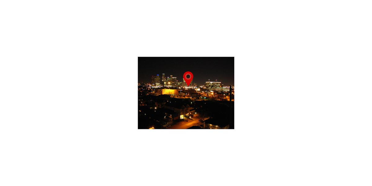

Quick: list Houston’s places of interest. Its activity centers. Its hot spots. When visitors ask you where they should grab a bite, shop, or see the town, where do you send them?
Galleria. Check. Downtown. Check. Chinatown. Check. Westheimer. Check.
What about East Little York Road? Or Highway 290 and Tidwell? Do those spots jump out to you?
Probably not, but according to the newly redesigned Google Maps, each of those is an “area of interest,” or a spot worth highlighting due to its retail and dining options. What the new designations shows about patterns of commercial development in Houston and elsewhere is fascinating. But equally intriguing is Google’s definition of what makes a place interesting.
The newly designated places are not bounded by hard lines; rather they are algorithmically determined concentrations of businesses, restaurants, shops, and bars. The boundaries are edited with “a human touch,” then highlighted in an orange hue on Google Maps.
Google clearly expects the move to help raise advertising revenue by creating a more helpful consumer experience and attracting more users. That the redesign is tied to improving Google’s bottom line demonstrates the biases inherent in every map.
But beyond making money for Google, the redesign acts as an activity guide to the city for users — both visitor and resident alike. The orange bubbles pull us toward these hubs.
What it says about Houston
For visitors to the city, such a feature is hugely useful. Where should we go for food? Just zoom in on an area of interest and check out the options. No more wandering around aimlessly hoping to happen upon a clutch of options. No more hunting out a specific restaurant highlighted on Google. Just head to the orange blobs. And as a local, the areas of interest offer me a chance to view Houston with new eyes as well and draw me to places I’ve never been.
The surprising diversity of the areas — in character, location, price point, and tenants — opens up even more of the city to exploration. Google didn’t just highlight luxury shopping centers or award-winning restaurants. It highlights more modest options too. Sure, some strip centers designated by Google as areas of interest aren’t particularly interesting – they’re populated by fast food and chain stores that you can find in dozens of places – but I didn’t know much about East Aldine’s string of delicious-sounding restaurants until Google told me I should look closer.
Google’s areas of interest include two types of development in almost every city: walkable, dense areas of activity along city streets (for Houston think Rice Village or Midtown) and isolated strip centers, malls and highway exits. Notably, there isn’t a visual cue on the map to distinguish the difference. The same orange blobs represent both types of places. The balance between these two types of areas depends a great deal on the city one is viewing.
For urbanists, there is much to celebrate about the redesign. This view of the world may help promote walkable, dense development. Drawing attention to interconnected activities asks users to see corridors as cohesive districts and to see the benefits of such agglomeration. A remaining hurdle for cities like Houston, though, is that many of these walkable districts remain accessible primarily by car.
Putting it in context
While Google’s goal may not be to encourage the growth of more concentrated activity, the redesign interacts in interesting ways with other maps of the city that explicitly do.
The Houston Galveston Area’s Blue Map, for example, outlines parts of town with high concentrations of jobs, residents, and intersections. The organization uses the system to highlight activity areas that may benefit most from capital interventions that improve the public realm for all street users — drivers, bicyclists, and pedestrians.
Likewise, the Houston Bike Plan, shows both existing and proposed networks and is an attempt to create a citywide network. The overall plan ties nicely into the information displayed on the Blue Map by showing how the proposed and existing system serves the many neighborhoods of Houston.
How do these maps connect to or diverge from Google’s areas of interest?
The image below, pulled from the Blue Map, outlines in red parts of town with a high concentration of jobs and residents. The blue bubbles represent areas that have a tight street grid and many intersections — elements of the built environment that provide an opportunity for a variety of street improvements. Here again Houston’s car-dependent structures stick out. Only older parts of town and specific subdivisions have high intersection density. The Blue Map shows that only a few areas of population activity and intersection density overlap. Downtown stands out.
Many of Houston’s strip center areas of interest fall within the red outlines but are not situated in areas primed for street-level improvements. Other areas highlighted by Google such as Rice Village and the 19th Street corridor in the Heights are primed for a more walkable fabric, but they require outside users to support the businesses, many of whom will continue to arrive by car.
Likewise, this snapshot from the city’s bike plan showing existing and programmed bike infrastructure in a small corner of the Inner Loop highlights the lack of interconnection between areas of activity. Today, even moving between Rice Village and Midtown requires biking on undesignated streets.

Comparing these locally produced maps with Google’s areas of interest shows the challenge the region faces in attempting to create more interconnected, walkable districts of activity. Google highlights nodes of activity, but its view cannot display their context. These local maps help place Google’s nodes alongside existing realities and challenges.
Is half of Houston ‘uninteresting’?
Another aspect of the new maps that jumps out is the absence of Google-designated areas of interest in huge swaths of the city. Only a small bit of orange can be found east of Interstate 69. This part of the region has a high percentage of lower-income residents, a larger share of industrial and manufacturing infrastructure and fewer concentrations of commercial and retail economic activity. This doesn’t, of course, mean that no activity occurs. It means the algorithm Google used did not register the form of activity that predominates there: more isolated shops and businesses spread among homes, along roadways or next to larger industrial tracts.
What are the consequences of Google Maps, a visible, popular product showing that no areas of interest exist in these areas? How might that designation affect the bottom lines of businesses not within a hub?
The hugely-successfully Harrisburg Esplanade, for example, is bordered by a row of local restaurants and houses a variety of public events. It is not highlighted. Might areas that are not recognized by Google’s redesign suffer? Will consumers and their wallets be drawn to other places?
Google could consider adding other elements to its algorithm. Perhaps it should balance the commercial with the cultural and recreational? Adding in points of interest, whether a park, museum, or art gallery, could change the display and bring parts of the city like the Esplanade to the viewer’s attention.
The Google Maps redesign offers a new way to look at our cities. The visual display of a city not only reflects its realities, but our interpretations of that display can begin to impact a city’s form and our daily patterns. There is a lot of city in between Google’s orange circles. Asking questions of the representations we encounter on our phones and in our plans presents us an opportunity to explore the ways our perspective of a space can change, based on how its drawn and what is highlighted.