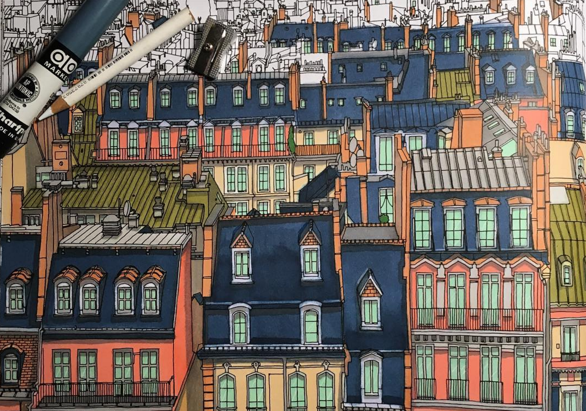
One of the hottest architecture books on the market right now isn’t a treatise on a design or a coffee table book from a well-known artist.
It’s a coloring book. But not exactly the type you remember from your childhood.
Canadian artist Steve McDonald’s new book, “Fantastic Cities,” hit the market in August. Today, it’s the third-ranked bestselling architecture book on Amazon. The success is somewhat of a surprise to the artist, who’s long had a love affair with cities and architecture.
“Architecture is truly universal,” McDonald said. “This hadn’t been done, and architecture was my first love. In my studio this is what I draw in my spare time.
McDonald often creates high-end gallery work, but by developing a coloring book, he sought to make his images – as well as the places he loves – accessible to a wider audience. The book takes readers on a tour across the world, presenting city views in places like Toronto, Greenland, Tokyo, Amsterdam and San Francisco, among other locales.
The images aren’t exactly photo-realistic representations of those cities, but they’re not fantasy either.
“Whether they’re coloring the book or enjoying it as a coffee table book or something in their studio, it leaves them with a language about architecture and buildings and dwellings,” McDonald said. “Whether it’s a tangible language they pull out verbally, or whether its’ a visual knowledge, I think it’s a wonderful tool.”
The book’s release comes at a time when coloring books are enjoying a surge in popularity among adults, where they’ve gained celebration as a sort of calming, analog release from our increasingly connected lives.
“Architecture isn’t a boy thing or a girl thing, and we thought that was wonderful,” McDonald said. “From my point of view, this book is everyone. I’d say it’s for coloring experts, whether you’re 8 or 80 and have a bit of free time and are craving … an easy, creative outlet.”
Fans of the book have been posting their own images of the colored-in pages to social media sites. “I look at some of these and think ‘I couldn’t do that,’” McDonald said.
The images are typically based on some sort of photographic reference point. Some of them are created using pen-and-ink. Others are created mostly digitally, using a stylus and a tablet. Still others use a combination of techniques. But the images have a consistent look.
McDonald sought to feature a range of places, focusing largely (but not exclusively) on cities he’s already visited. Some images, like San Francisco, feature neatly defined streets. Others, like Rio de Janeiro, offer more chaotic scenes. “You start to appreciate the uniqueness of a city’s architecture when you see it beside a city that’s completely different,” he said.
One image that’s especially sentimental to him is the dense urban environment in Jodhpur, India, where the lines of the dwellings he’s drawn are so close together it’s almost impossible to imagine someone having the discipline to color them in.
“I’ve spent a lot of time in India,” McDonald said. “My wife is part Indian, and my kids are part Indian. It’s one of the first places I really got the opportunity to get these great vantage points from above.”
“(The image) is way too complicated to appeal to a sane human, and I love that about it. It really gives you a taste of … India. It’s not a grid. It’s this idea of organic growth that occurred over centuries.”
McDonald’s next coloring book, called “Structures,” will be released in March.

