
 Image via flickr/cgauthier2112
Across the country, rents are soaring -- and yet, more and more people are moving into rental units. The U.S. homeownership rate is at its lowest level in two generations. Although the cost of rent is increasingly unaffordable, for many consumers, renting is the only option, since homeownership is even more unaffordable.
Using data from the U.S. Census, we can see that about 44.5 percent of Houston's housing units are occupied by residents, compared to 55.5 percent of housing units occupied by renters. (Article continues below chart.)
This puts Houston roughly in line with the country's other major cities, as illustrated in the chart below. But collectively, those urban locales skew much more towards renters than the country-large. Although homeownership is way down in the U.S., it's still the dominant housing arrangement. Nationally, owner-occupied units outnumber renter-occupied units by almost 2-to-1.
But where do those people live?
Journalist and web developer Ken Schwencke has created a useful tool to help visualize that status of housing units in places across the country, including Houston.
Looking at his maps, clear patterns in Houston start to emerge. Census tracts in spots like Montrose, Greenway/Upper Kirby and Gulfton are colored bright red as a result of their high proportion of renters. Some of the darkest blue spaces -- those dominated by owner-occupied housing -- are in The Heights, West University and the Washington Avenue corridor. Click below to enlarge; click here for interactive.
 Image via Ken Schwencke
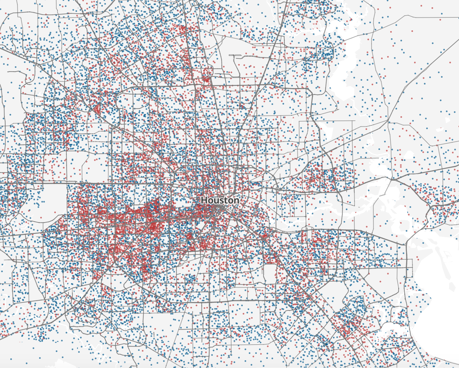
But then, Schwencke takes the visual presentation a step further. Instead of simply coloring coding census tracts, he places dots within them. Each dot represents 25 housing units, with the same color pattern -- red for rental units and blue for owner-occupied units (the dots are placed randomly within each Census tract but still give a general idea of housing patterns). Suddenly, the map is able to convey another dimension of housing. We can now see not just where owners and renters live, but also, how densely they live. Click below to enlarge; click here for interactive.
 Image via Ken Schwencke
What's immediately stark is a dark, dense jumble of dots that starts in Montrose, just west of downtown, and continues along US-59 to Uptown, then Gulfton, then parts of Sharpstown, all the way over to Beltway 8 and up to I-10 before ending around the Energy Corridor. It's a band of (relatively) densely clustered rental units that extends almost 20 miles from downtown.
It's a clearly recognizable pattern and one that's worth keeping in mind, since it cuts across economically and demographically different parts of the region.
So often, when looking at maps of Houston, a single image is omnipresent -- the "arrow" on the west side of town that simultaneously represents the whitest parts of the region as well as those with the highest incomes.
But keeping this red band of renters in mind is important for two reasons. First, it gives us another way of conceptualizing the economic and housing patterns of Houston, beyond that arrow, as we work to better understand and analyze our city.
But it also reminds us that dense areas of rental units aren't just confined to the heart of the urban core, and in fact, they can exist well beyond it, lending further credence to the idea of "suburban urbanism."